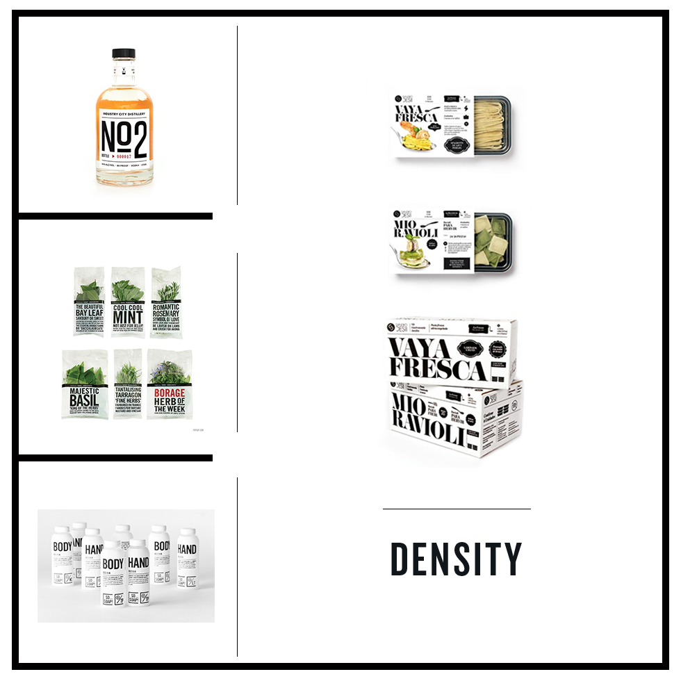
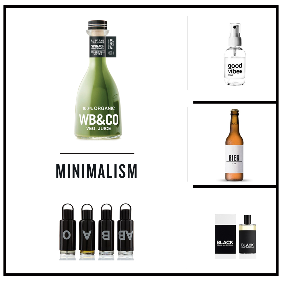
To those infatuated with type, an understanding of just how beautifully certain letters and typefaces work together for a common purpose is not a complex concept to grasp. Not infatuated with typography? That’s weird, but, no worries. The magical workings of point size, line length and kerning create a coherent and visually satisfying message, most often, without the awareness of the reader. Ever watch the movie Helvectica? You should. It might give you some perspective on just how big a role typeface plays in our every day lives. Sometimes type aims to sell more products, other times it serves a functional purpose. The letter size and font choices on highway and emergency signs for instance are designed for optimal legibility. Though the serif originated in Roman lettering to neaten up the ends of lines as they were chiseled into stone, today typography is considered an art form of its own. Our selections of package design today, broken down into three sections (bold density, bold minimalism and bold calligraphy), drive home the point that when done well, typography is an inspiring marvel in its own right.

Check out more Trends in Packaging Design here