T
rendland recently had a conversation with Arianna Lelli Mami and Chiara Di Pinto, the outstanding designers behind Studiopepe, about Italy, inspiration, and style. The design studio’s use of geometry and color has become a trademark of their unexpectedly unique works. Luckily for us, a chance meeting in Mexico brought these brilliant minds – purveyors of good taste, as we’d like to call them – together. The most endearing aspect of Studiopepe’s work is that it’s the effort of a duo who have fun doing what they do, and do what they love.


TL: I know that there’s an interesting story behind the beginnings of Studiopepe that starts in Milan and ends in Mexico! Can you tell us about it?
Chiara: How did you know?! Yes, Arianna and I attended the same university in Milan and studied industrial design at the Politecnico. We knew each other, both worked as assistants in the university, but we were not close friends. After graduation we both went on vacation to Mexico – not together – and in a very small town on the Pacific coast, where there’s really nothing outside of the hammocks, we met by chance! We did the rest of the trip together, and once back in Milan we decided to try to collaborate, and that’s how the editorial of the rebus for Case da Abitare was born. And then it was even chosen for the cover! It was great! Everyone told us it was not the right time to start something, but we went on, and since then many things have happened! We were very lucky to have met there; probably if we hadn’t, we wouldn’t have started to collaborate, or at least not in that very moment.
TL: Why the name “Studiopepe”? Where does it come from?
(Chiara laugh!) CDP: Actually it’s a silly name, but it was the one used for our mailbox in the first studio at Arianna’s place, because it was in Milan in via Pepe, and we decided to keep it for our foreign clients to easily remember.
TL: Your works have a strong geometric aspect and are well planned and executed, and yet they don’t lose their contextualization. Where do you get your inspiration?
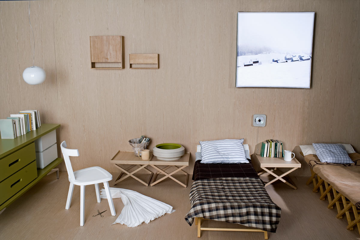
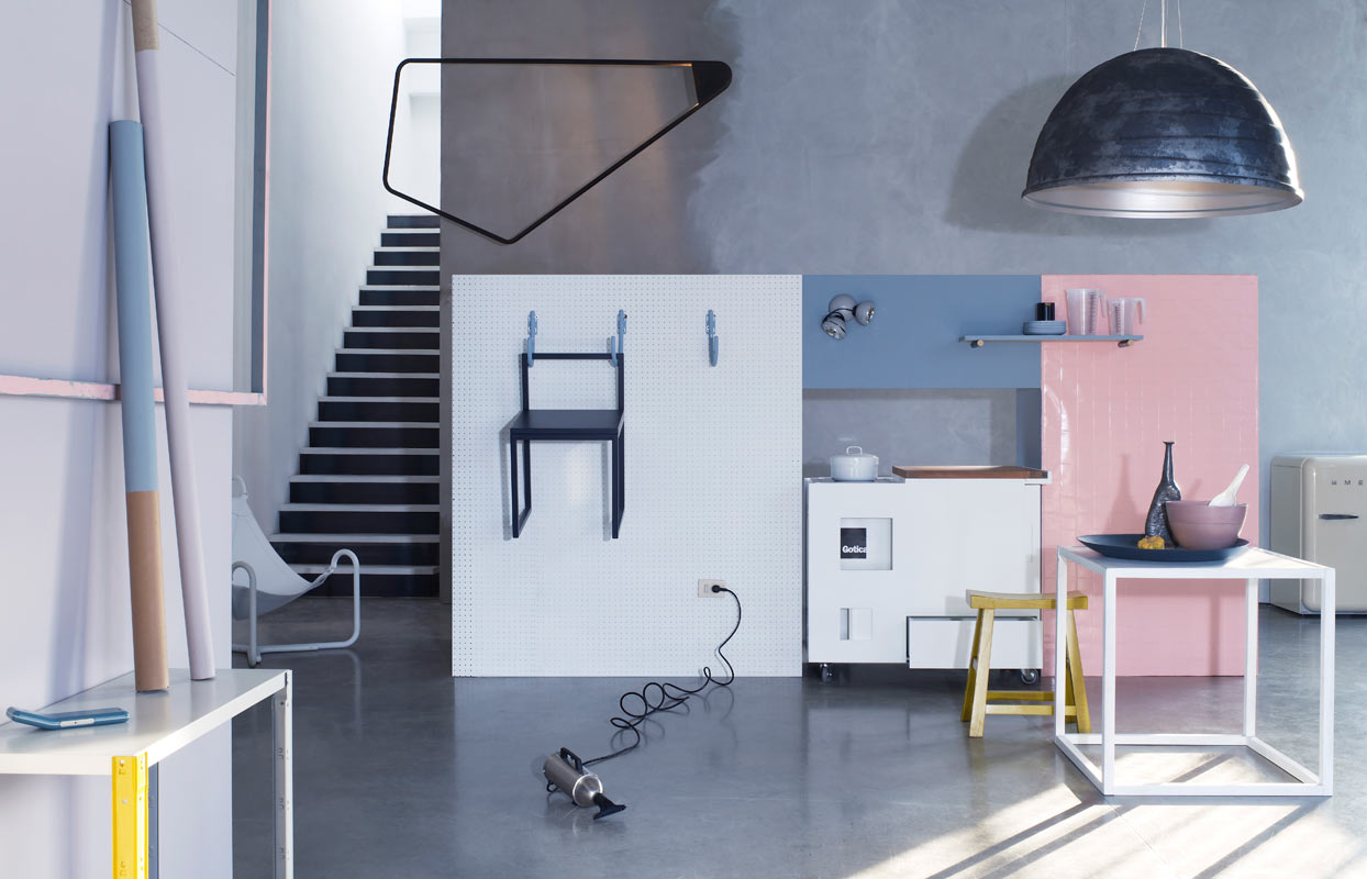
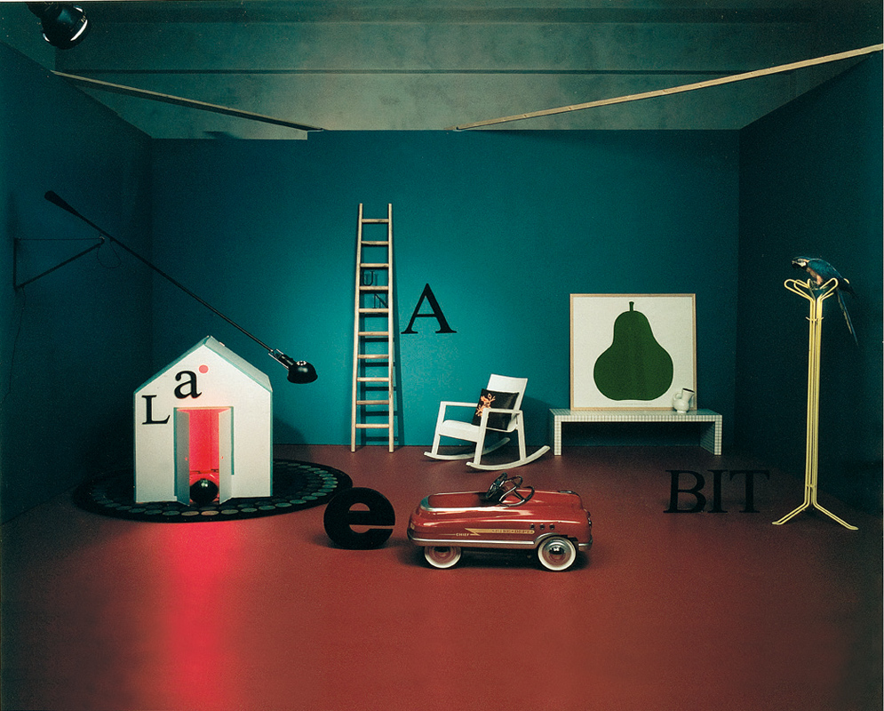
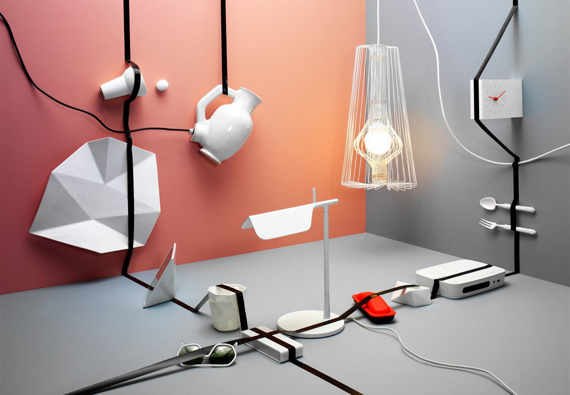
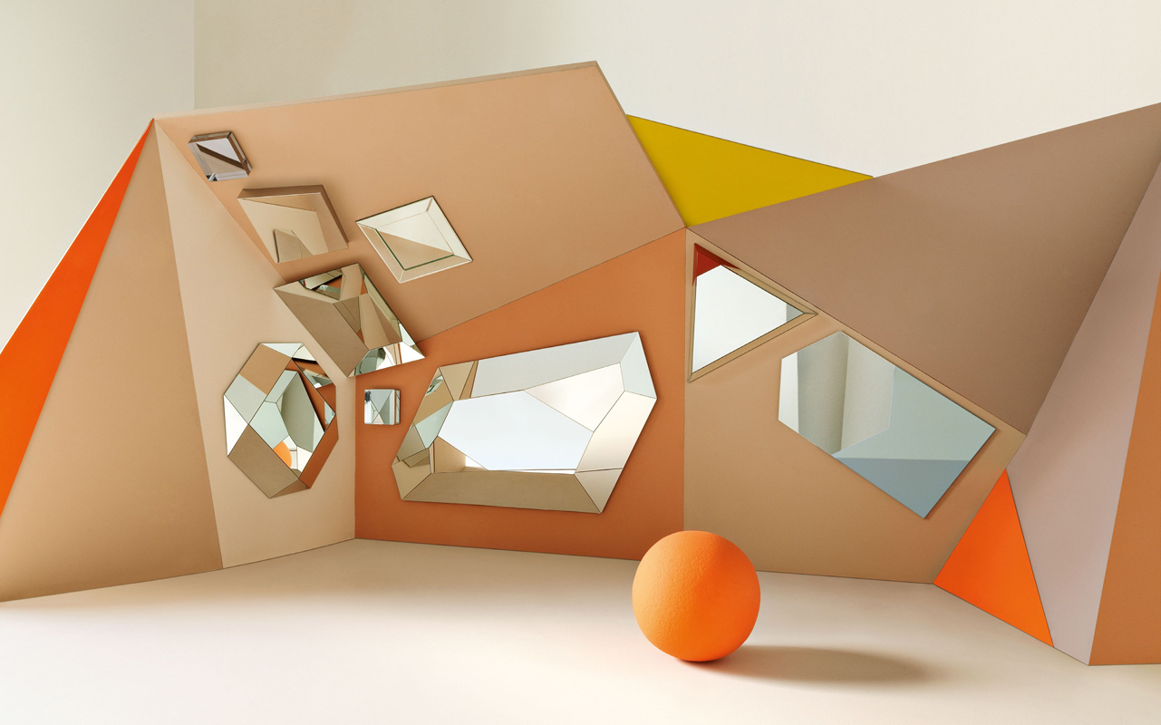
CDP: What a question! It’s a matter of some innate feelings, the fact that everything must have a geometry, as well as the choice of colors. Even if the image has a very naïve, or natural component, we always tend to add a geometric element that gives it a certain precision, which during the time has become a bit our mark, without being planned. It’s just the result of a personal taste and professional background. When someone says: “This is very Studiopepe, it’s clear that you did it!” this is, in my opinion, the best compliment for us and our work.
At the beginning we used to be much more surrealist. We loved De Chirico, for example, and Sol Lewitt is another of our reference artists. Contemporary art is a big source of inspiration, especially art installations. Maybe there is just a detail that keeps catching in the net, and then we work on it. For example, an editorial that we did for Dcasa de LaRepubblica, came from an exhibition of Fischli & Weiss, where the two artists are disguised as stuffed animals!
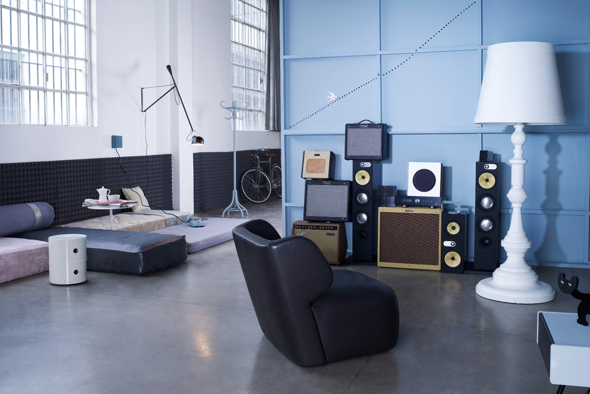
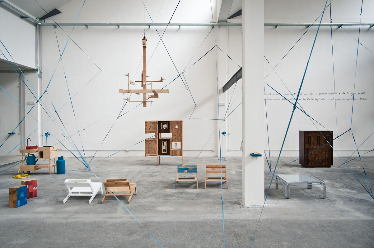
Arianna Lelli Mami: For us, the object is part of the architecture, and the architecture integrates itself very much with styling, with the objects and the additional elements, through the set, the finishing, the colors and choice of material. For us it’s a very fluid combination. We like Gio Ponti, an architect who not only thought to the structure, but also to the interior. It all comes together into a unique idea and fluid spaces.
So what we try to bring to our interior projects, and also to shop windows or photo shoots, is this concept where everything is fluid and the objects, though different, are studied to strengthen each other and have a dialogue. Inspiration can come from everyday life, but then you see what echoes with your background, with what is already part of you. The goal is to be receptive and prepared for what can grasp you suddenly.

Inspiration can come from everyday life, but then you see what echoes with your background, with what is already part of you. The goal is to be receptive and prepared for what can grasp you suddenly.
TL: What is the meaning behind the colors you choose in your works?
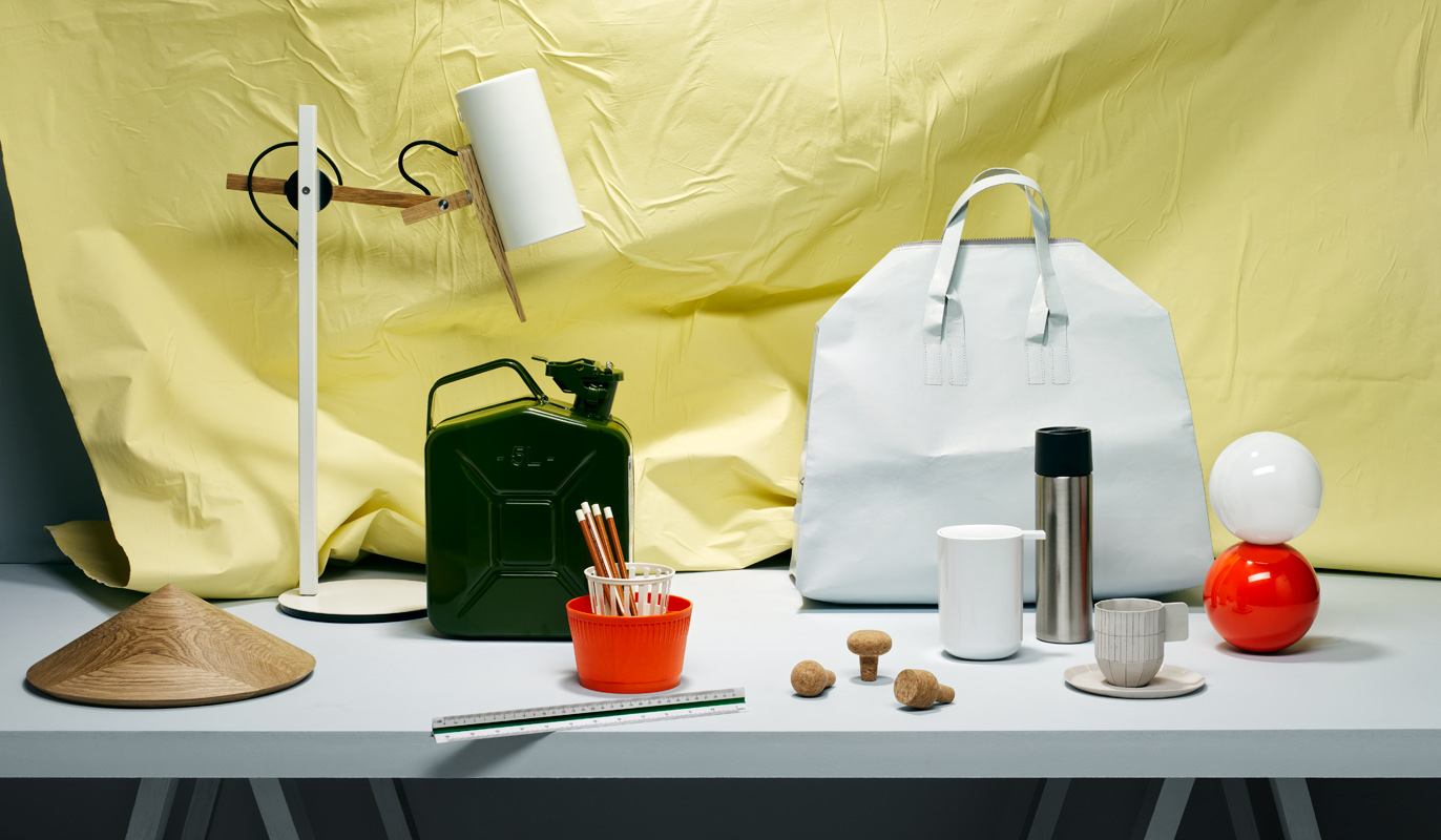
ALM: Color for us is a world, a happy exploration. Everything starts like a brainwave: there is already something that whirls in the air. Both Chiara and I, and also our assistants, we’re already predisposed to certain kinds of colors and palettes, for which there is a feeling, and then it happens, that thing that gives you a revelation, a juxtaposition that you see in art, in a painting, a movie, an outfit, and like a detonator it triggers the spark.
For us the object is not the important thing, but just something that supports the color, because the color is our protagonist. It’s a little like the Italian painter Giorgio Morandi, who in his painting used simple objects from everyday life. They really shine in his paintings thanks to the combination of colors and shades. The object must not overwhelm the idea.


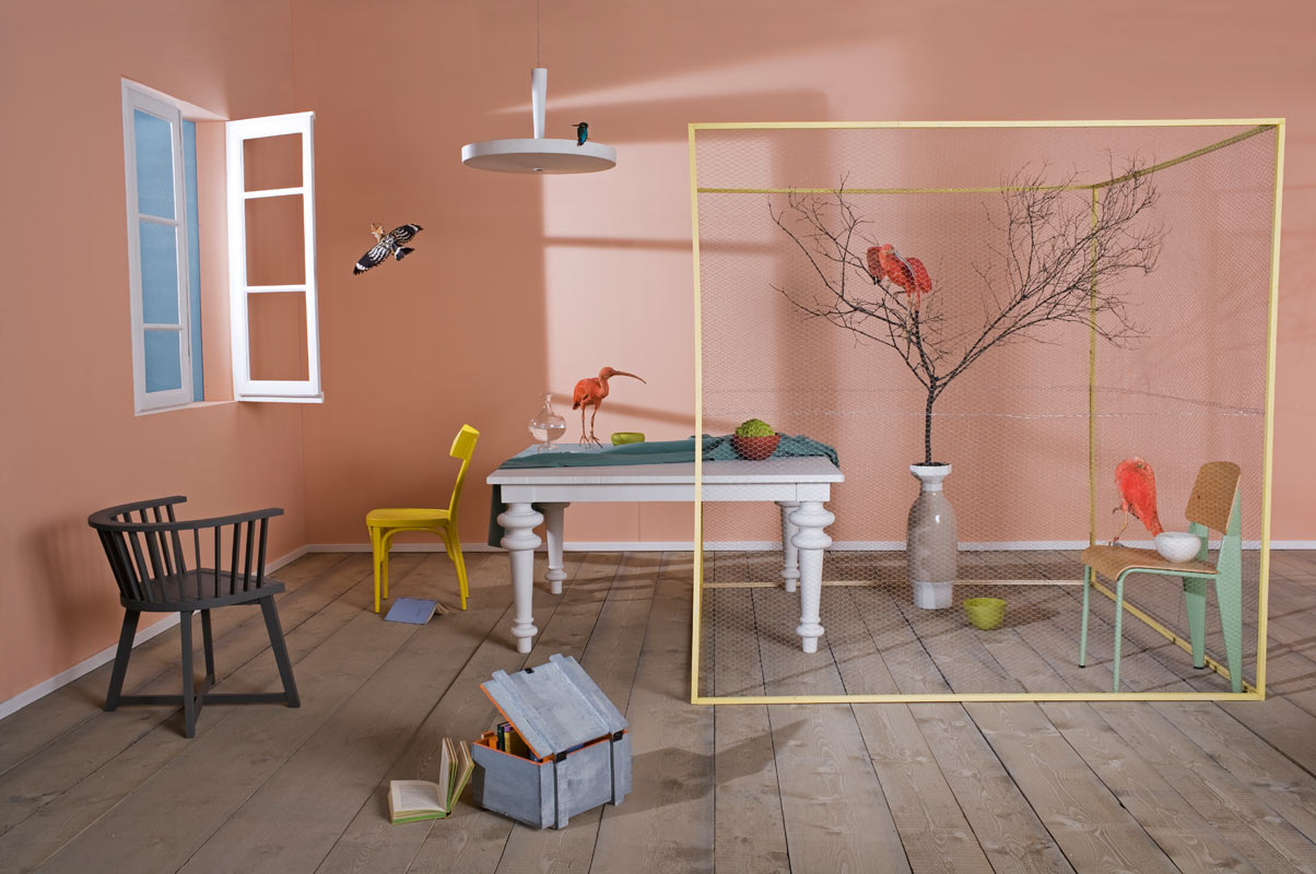
TL: Often two-dimensional and with no people or characters, your projects always look like they are telling a story, and the setting and objects seem to hide a secret life. How do you create this unexpected effect?
CDP: It’s absolutely true! When we do an editorial or an exhibition, we mainly try to tell a story. We cannot have a good start to a project if we cannot find a name. The name is something which then comes with us and, as you say, we always try to imagine what can happen in that room: “what kind of person or what kind of story may stand behind this environment?”
It is not simply taking interesting objects and putting them together with good taste. What we try to do is something that can amaze, even with some small clues that maybe not everyone can capture. Sometimes we put small details, and when the viewer recognizes them, it becomes something curious and the story becomes more complete in some way, sometimes imperfect but definitively outstanding. In these photographs there isn’t a model or an animal, a protagonist on which the eye falls so it’s always very static, but we try to avoid this by including something that will surprise you!

TL: Which is your most exciting work, and why?
CDP: Well, all the projects have special features, so I couldn’t choose just one! But the first shop window for Max&Co. was very exciting. Also because the work and the development lasted so long, we really enjoyed it when finally we saw it finished.
TL: How do you approach collaborating with other brands and designers?
CDP: Our latest collaboration is with the clothing brand Max&Co. It’s not a joke, but also in this case fate had a hand, because the head of Visual Merchandiser saw us while we were setting up Spotti’s window and some objects we were using really stroked her. But the nice thing is that we discovered who she actually was only after long time – when they called us for a project! Sounds incredible. We started with the moodboard for the interior of their stores, and then came the collaboration for the windows. Now we have also started working for a MaxMara pop-up shop. It’s a beautiful team with a brilliant manager. They are very young and open, which gives us a lot of encouragement and satisfaction in our work. We are doing some cool things, especially because they really support us.
As for the industrial, collaboration with brands always comes from the need to do a piece exactly as we have it in our mind. That is, for instance, how the Kora Vase was born. It’s a vase we wanted for a set-up and then we decided to make a small capsule collection with 12 color variations. That had a lot of success. Especially for the industrial, we try to select and prioritize the projects according to our taste, because the most important thing is that you understand that we did it; we’re not a big studio, and for us the most important thing is preserve just that – the spirit, rather than creating 200 pieces and losing our identity.
If then we are directly asked to create objects, that is okay, but only according to our philosophy. As Arianna said, “it’s a fluid work process.”

TL: According to you, what is it that creates irony and magic in your works?
CDP: We always try to reveal the unexpected without being forceful. A project can be something very correct and clean, but must have that “unusual spark” to create the unexpected. All the elements – the colors, the objects, and the furniture – put together give this sensation. I don’t see these elements as pieces of furniture, I perceive them as forms, from a geometrical point of view, that can be displayed together. I think that magic comes also from the differences between me and Arianna.
First we talked about being fluid, even issues and inconveniences related to that. They give you the extra push to do something you normally wouldn’t do, because we wouldn’t seek an alternate solution, a plan B, which then becomes the detail that marks the difference. We’re something like funambulists!
TL: Who does what in your team?
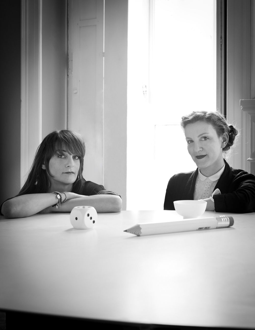
CDP: We are different but we have no predefined tasks. It is a great gathering more than a role division. We don’t always work together, but the first creative steps in developing the concept is something that we always do together. Ideas come in a very natural way, talking and drawing. We are a sort of a Frankenstein! There is a continuous exchange of opinions, and photos taken around, things that strike us, including our assistants that contribute with their ideas, even if it may seem hard to participate in our conversations! I’m sure that if I did the same job by myself, without Arianna, the result would definitely be different. Each one carries a kind of personal aesthetics, but what we’re doing here comes from the fusion of the two of us.
Color for us is a world, a happy exploration. Everything starts like a brainwave: there is already something that whirls in the air. Both Chiara and I, and also our assistants, we’re already predisposed to certain kinds of colors and palettes, for which there is a feeling, and then it happens, that thing that gives you a revelation, a juxtaposition that you see in art, in a painting, a movie, an outfit, and like a detonator it triggers the spark.
TL: Chiara, if you would have to make a styling project representing Arianna, what would you use?
CDP: Arianna is black&white. And a compass table by Jean Prouvè – rigorous but soft and sophisticated.
TL: Arianna, design objects and common things that best describe Chiara?
ALM: One of the nicest things you need to know about Chiara is that she never gives up, she’s always ready to try to do things even if they’re absurd. She is very good with DIY, she manages to put pieces together to create geometrical shapes. So, rather than a specific object, I choose “materials”: colors, tools, all these things that are used to build, a sort of an ‘ABC of creativity’.
TL: Of all of your many kinds of work, such as editorials, advertising, interiors, which is the aspect you most love?
CDP: We do few advertisements because you can’t have total control. When I started working, and it was for advertising agencies, I never felt satisfied 100%. The most important thing for us is a total control of all 360° of the project, from concept to finish. Maybe it’s what we were talking about before, our need for geometry! If you have the control of the set, the products, the furnishings, the graphics, even the lighting and type of music, it will become a more organic project, that represents you more. Otherwise, you need to reach a compromise, and that’s really hard for us.
ALM: We really enjoy doing photo shoots, as Chiara said, when we can be more free. There is always a kind of magic. I personally love making the set up of the shops’ windows, such as the work we do for Spotti in Milan. It’s a mix between a project of interior, but with less budget problems because the pieces are already in the store. In addition, we must also handle it as a space that will welcome people, so it’s a very complete project. As for the industrial, I like the fact that the pieces that we have designed and produced arise always from the need to have that object in one of our projects, and that comes from the practical knowledge reached during that time in terms of materials, taste, or trends. We are very happy because they are really successful, like the Kora Vase. They are well calibrated, and they all come from aesthetic requirements but in the end, on a domestic and everyday level, work perfectly.
TL: How’s the evolving international design scene? Did something or somebody strike you recently?
CDP: In terms of geography, the Netherlands is still a good rich soil for young talents, as it’s always been. They are great with experimentation because their educational system pushes them. We can see that when students from Eindhoven come for an internship here, they have a preparation very different from the Italian ones, they are taught to think more about the concepts, which is a beautiful way of thinking about the projects, in my opinion. Muller Van Severen are two young Belgian designers who make outstanding objects made of polyethylene and copper, and we have often used their pieces in our work. They have a nice color palette, are very refined, they are absolutely a duo to watch! They nod a little to contemporary art.
ALM: In Italy there is very little experimentation in my opinion, they are more canonical, the other side of the coin of our tradition of Made in Italy. The fact is that people are not very free to experiment. Abroad, young people especially are more creative. They take things from the markets, readapt them, repaint them maybe, and they experiment more with everyday objects.
TL: Future projects?
CDP: We are doing a lot of different things, for example – it’s a bit secret – we are currently working on a collection of objects that will be produced by a brand called Menu, with contrasting materials. We just did the interior and the windows of the new MaxMara store in Tokyo, a very beautiful and challenging project. The projects are going on with them because it is a good team, we continue to make the windows for Max&Co, we’ve also done consulting for the corporate image, something more graphics-related. We are also working with a Danish brand, andTradition, which produces furniture and small accessories, with whom we have just prepared the first part of the catalog. Now we’re working on consulting for a corporate identity, and a new catalog … I mean, a lot of things! It’s a cross work: here in Italy it’s hard to understand what we do, so if to be defined only as a stylist is a bit limiting. The same thing for an interior designer. We like to cross over industries. The real luxury is the possibility to choose, and for now we’re very lucky. You fight for something, and at the end you can say ‘I did it!’