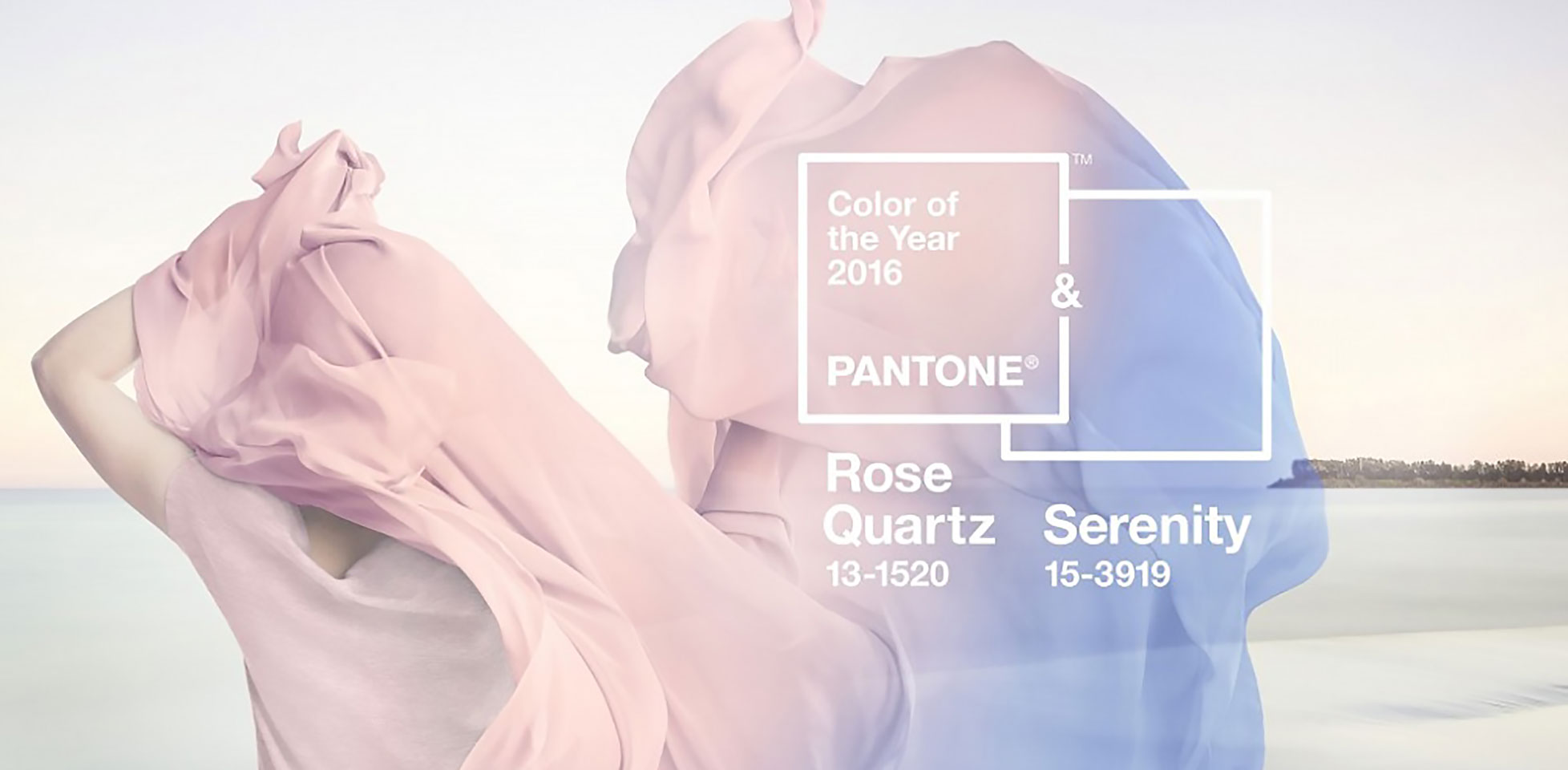
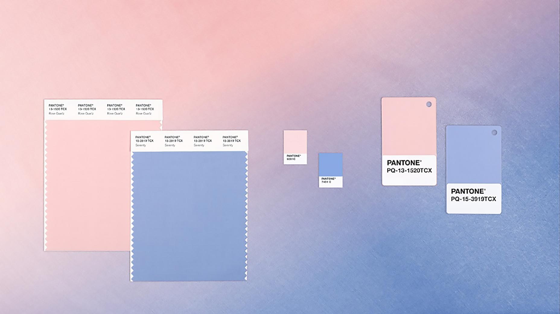
This year PANTONE not one but two colors to represent the PANTONE Color of the Year for 2016 –The colors selected, based on trend analysis, emerging techniques and materials, guesswork, and marketing, are 15-3919 Serenity and 13-1520 Rose Quartz.
Their thoughts are that as the world is becoming more tolerant of gender equality and fluidity, that it naturally impacts the color trends happening throughout design everywhere. The two shades blend together but also pair up to evoke a feeling of tranquility and inner peace, which was what PANTONE was looking to achieve.

[Rose Quartz and Serenity are] a harmonious pairing of inviting shades that embody a mind-set of tranquility and inner peace — Leatrice Eiseman, Pantone Color Institute
In many parts of the world we are experiencing a gender blur as it relates to fashion, which has in turn impacted colour trends throughout all other areas of design — Leatrice Eiseman, Pantone Color Institute
In addition to the colors selected, Pantone has also named a full range of complimentary colors that work well with the pairing.


