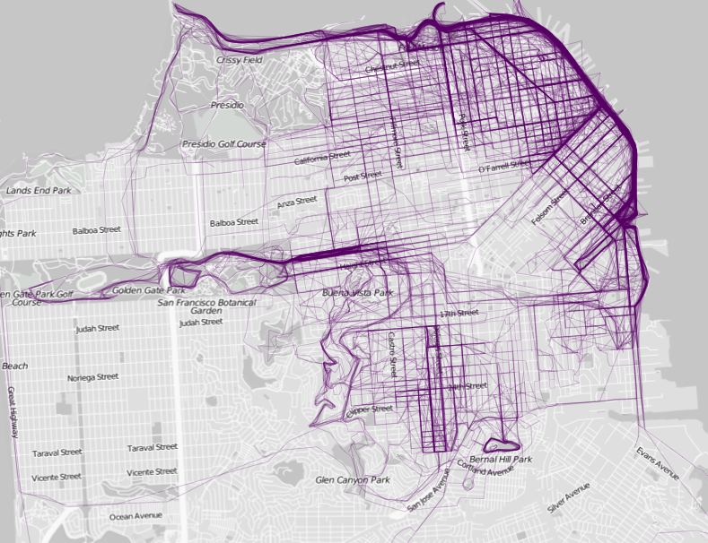

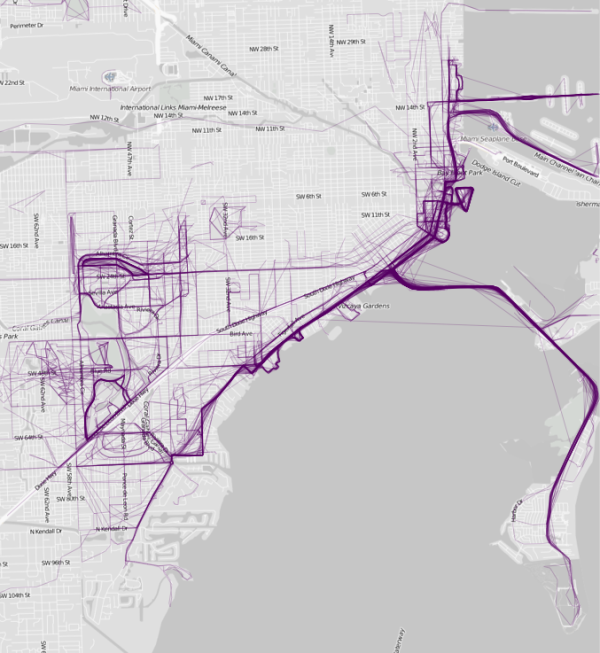
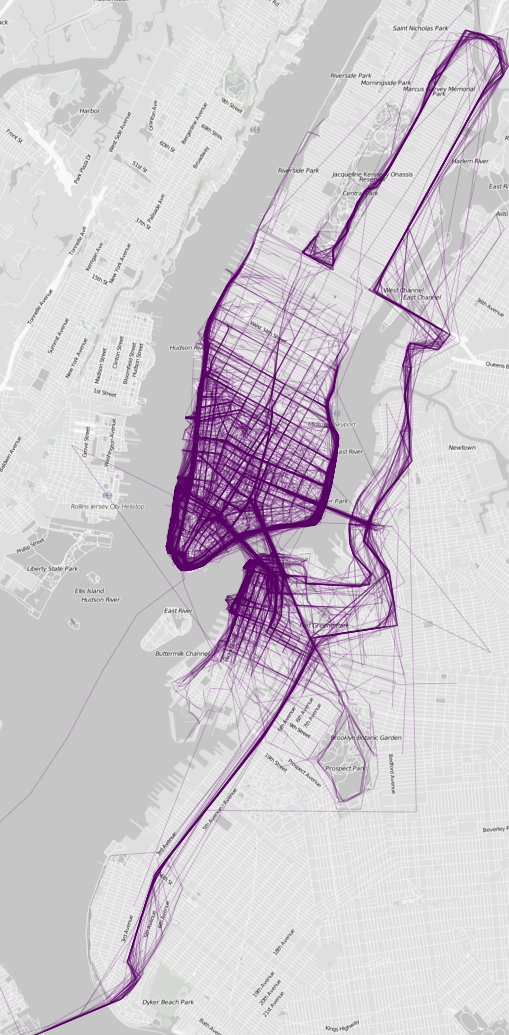
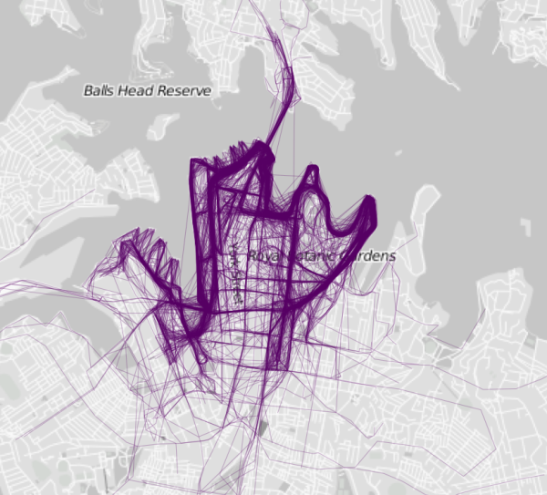
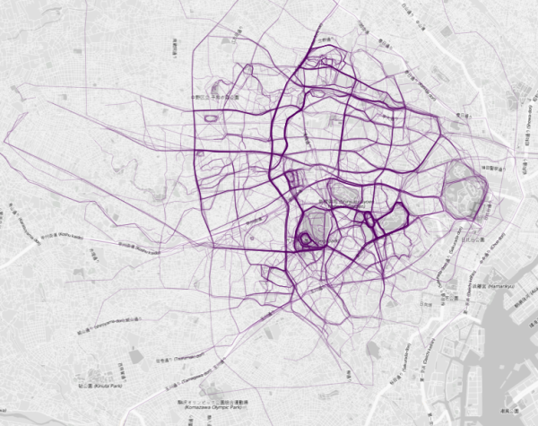
Running and sports in general have become a social activity. There is so much technology and specifically apps available to help you track every aspect if your activities, but what are we really doing with that data, other than posting across our social media handles to show people how disciplined we are. Flowing Data, a blog dedicated to the visualization of data, decided to take a piece of that information and create these beautiful graphs showing where people run in different cities around the world. Through the graphs you can quickly confirm, as you probably already imagined, that most people run in parks and along the water, where it exists.
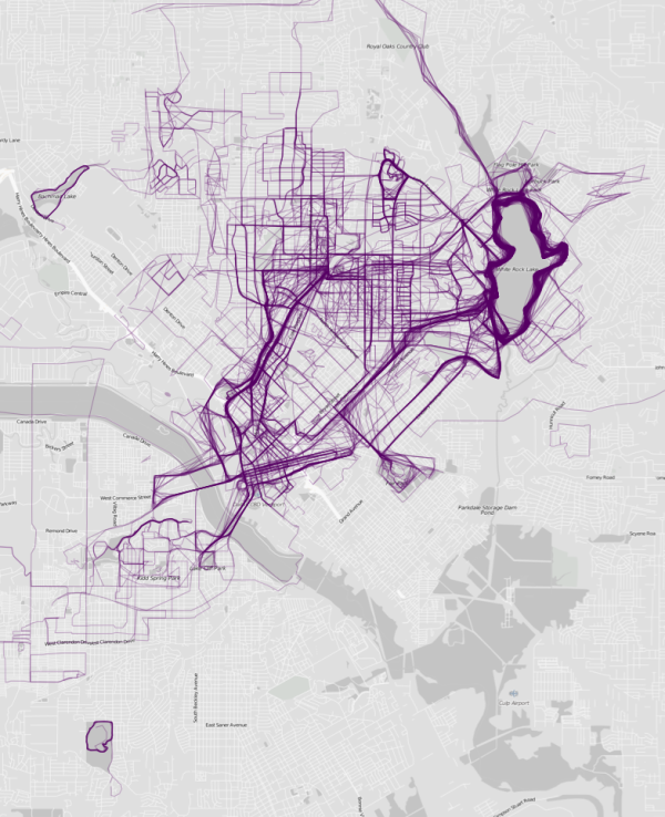
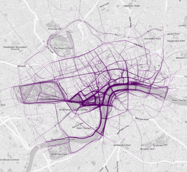
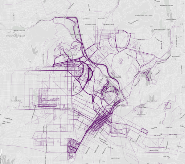
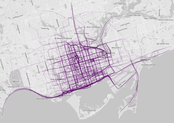

See all the map on Flowing Data, www.flowingdata.com
via www.fubiz.net


