
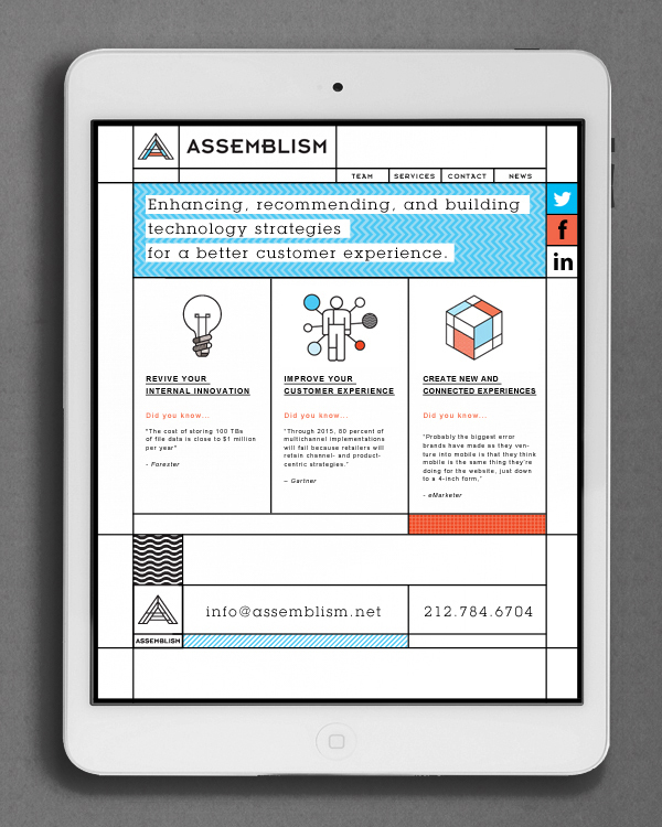
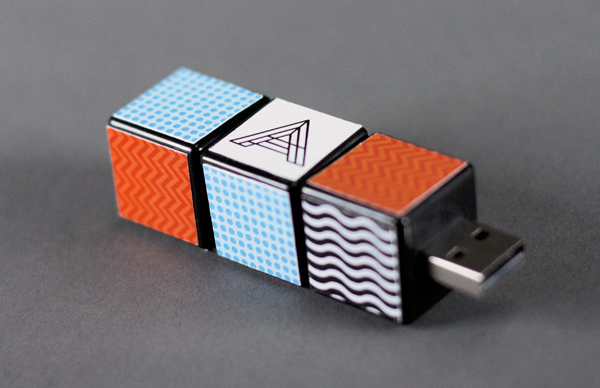
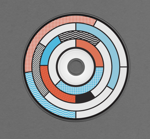
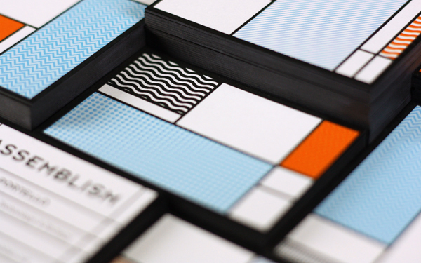
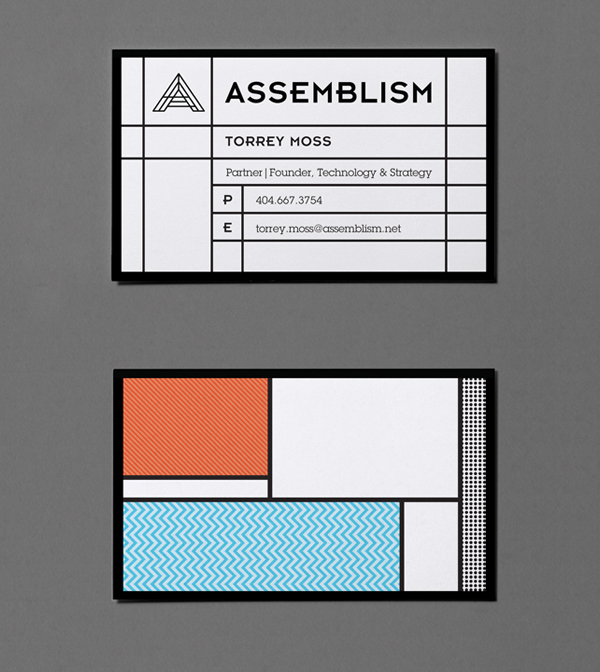
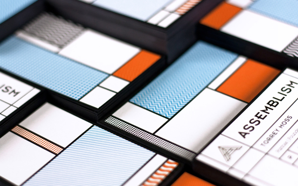
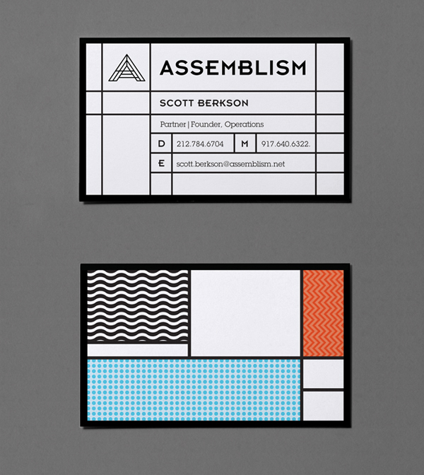
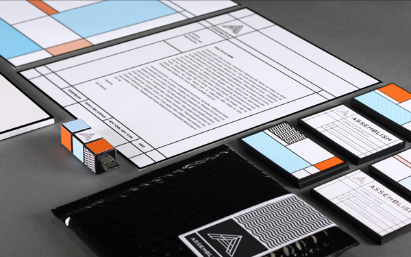
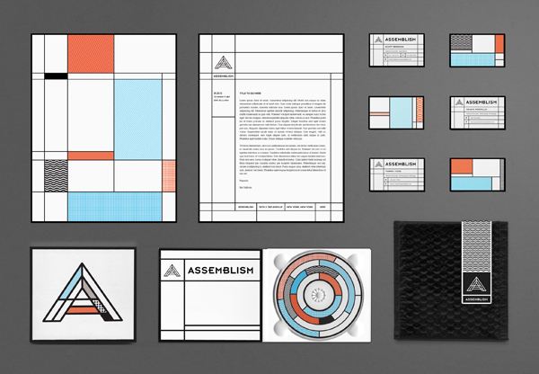
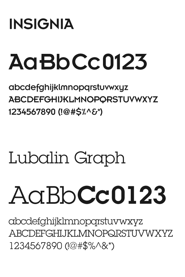
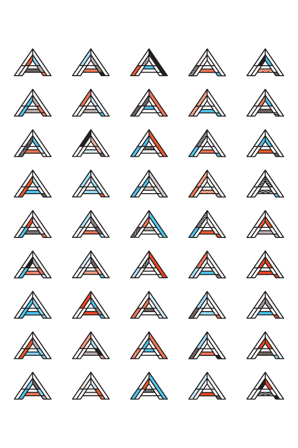
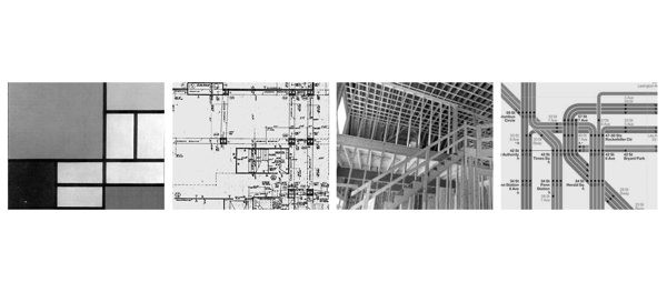
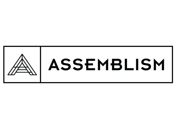
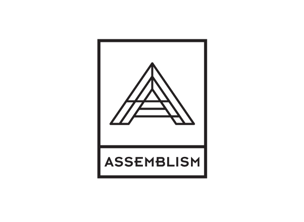
To make technology consulting firm Assemblism stand out visually in the saturated technology consulting market, art director and graphic designer Michael Molloy created a set of graphics for the company’s new identity. Keeping to contemporary typography with clean, bold lines, Molloy added pops of teal blue and orange for the company’s “A” logo. The letterhead and stationary subtly references the work of Piet Mondrian with multicolored and differently sized rectangular forms, and web icons are creatively animated.
For more information, visit the project on Behance


