This week we are dedicating our section to great albums with remarkable illustrated art covers. For that, we selected some iconic sleeves from albums that we love. Not only the sleeves are great but if you have the chance listen to all of these albums do so because they are all masterpieces. Some of these records had huge commercial success and others definitely stand as underground anthems.

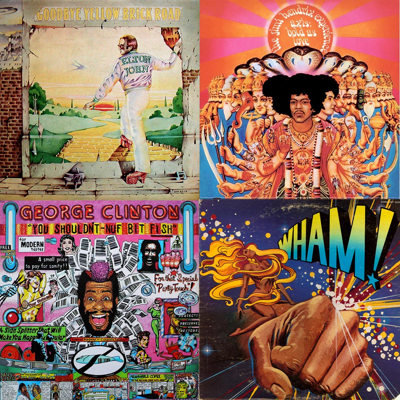
1. Elton John – Goodbye Yellow Brick Road
Elton John is definitely remembered for iconic album covers, from Madam Across Water to Captain Fantastic And The Brown Dirt Cowboy, Elton always scored with some intense artworks. Nevertheless, Goodbye Yellow Brick Road is definitely our favorite album & artwork from the artist, it’s easy to state that with so many hits like: Benny & The Jets, Goodbye Yellow Brick Road, Candle In The Wind and Saturday Night’s Alright For Fighting, just to name some. The cover art with Elton going inside a poster with the “yellow brick road” ahead is a surreal, dreamy and poetic glimpse of what you are about to listen. The cover art was developed by Ian Beck, who used to work for legendary magazines like Cream the rock n roll bible, the inner covers show beautiful typography and illustrations developed by David Larkham & Michael Ross The album’s co-Art Director, David Larkham, was working out of Los Angeles at the time and flew to London for four days to nail down the entire album packaging concept (including the inside-sleeve lyric spread). While David was traveling, Steve Brown (co-ordinator) met with Ian to discuss the project and play him some of the songs. “When I arrived on the Friday,” David says, “Ian came back with his portfolio. And I checked that his schedule allowed for working over the weekend, which it did.” The inspiration for the Goodbye Yellow Brick Road was a prior illustration that Ian developed for the cover of Cream magazine with David Bowie staring longingly in front of a wall with a Starman poster stuck on the wall.
Year: 1973
Label: DJM Records
Art Direction: David Larkham / Steve Brown
Artwork/ Illustration: Ian Beck (https://ianbeck.wordpress.com)
Inside Cover Illustrations: David Larkham & Michael Ross
Inner Sleeves Below:

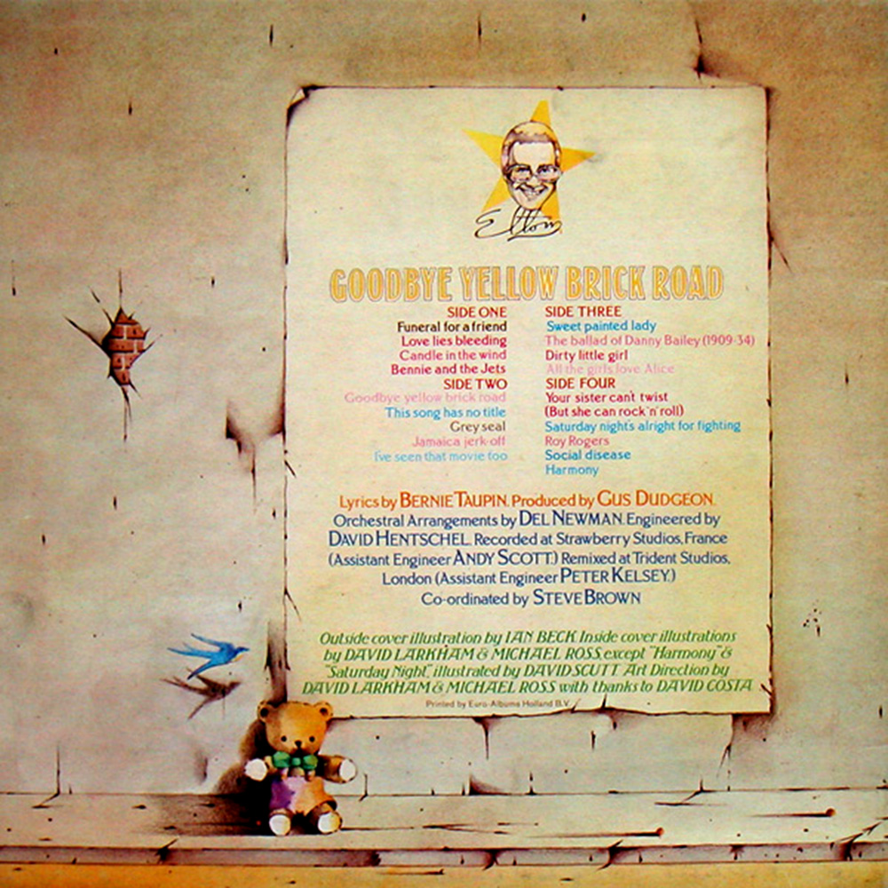
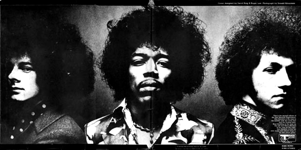
2. The Jimi Hendrix Experience – Axis: Bold As Love
Axis: Bold as Love, the second studio album by The Jimi Hendrix Experience, released in December of 1967. The record label chose an Indian based painting of the band for the cover because at the time, “All Things Indian” was the fad of the music world. The cover shows a painting of Jimi Hendrix, Noel Redding and Mitch Mitchell superimposed over a mass-produced Hindu painting. The illustration for the artwork cover came from a picture that photographer Kal Ferris did of the trio and also from a Hindu painting known as Viraat Purushan-Vishnuroopam, an iconographical form and theophany of the Hindu god Vishnu or Krishna. Although he appreciated the symbolic meaning, Hendrix was disappointed with the album cover. He thought it would have been more appropriate if the painting showcased his Native American ”Indian” heritage instead of Middle Eastern “Indian”.
Year: 1967
Label: Trak Record / Polydor
Artwork: Roger Law
Inner Sleeves Below:
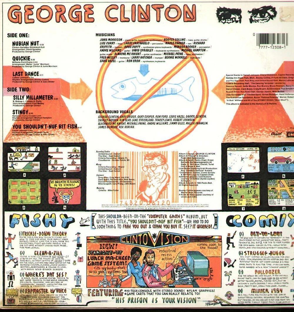
3. George Clinton – You Shouldn’t-Nuf Bit Fish

You Shouldn’t-Nuf Bit Fish is George Clinton’s second solo studio album was definitely not a huge commercial effort. Nevertheless, the 6 track album is a promise that your skeletons are going to shake. Pedro Bell was the illustrator responsible for numerous Funkadelic and George Clinton albums. On George Clintons own words Bell’s “stream-of-contagion text rewrote the whole game. He single-handedly defined the P-Funk collective as sci-fi superheroes fighting the ills of the heart, society, and the cosmos…As much as Clinton’s lyrics, Pedro Bell’s crazoid words created the mythos of the band and bonded the audience together.”
Year: 1983
Label: Capitol Records
Artwork: Pedro Bell with the Splankgraphic Allstars/ G “Sir Lance” Everett, Turtel Onli & Bruse A. Bell
4. Wham – Wham
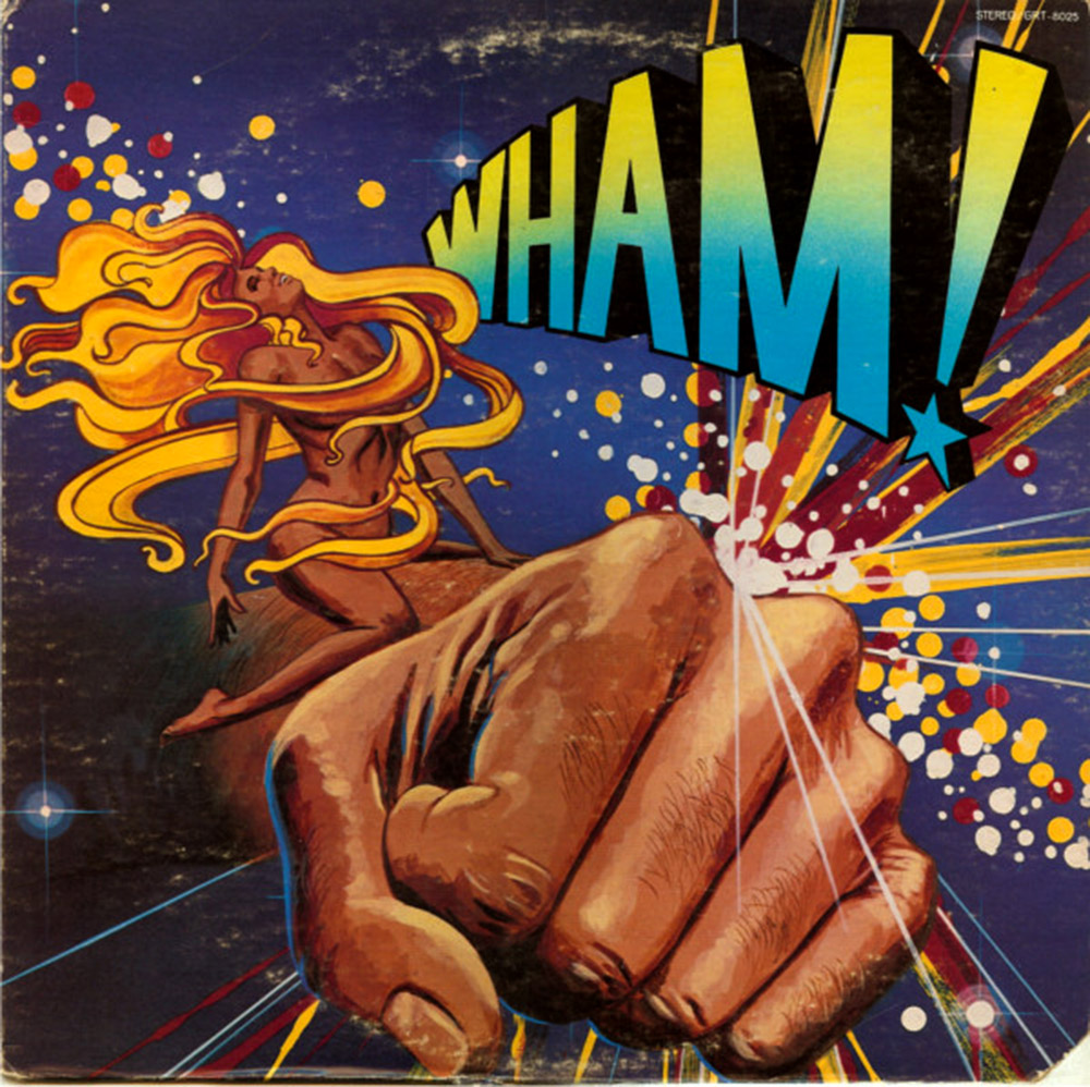
To get things started, this Wham is not to be confused with the later George Michael fronted Wham out of the UK. This album carry some sick disco floor filler bombs like” “Lovemaker” a laid back string infused track that out of nowhere surprises you with a simple, but solid break. There is no info about the illustration cover but it’s surreal drawing is sexy, colorful and contagious.
Year: 1978
Label: GRT / Janus Records
Artwork: N/A

This selection is brought to you by Arara: a creative & production studio run by Malu Barretto, Rodrigo Peirão and Pedro Igor Alcantara located in Rio de Janeiro, follow them on instagram @ararainc.


