
Halfway between ligature and contraction, the beauty of the ampersand is it stands alone with clear meaning. Often called the 27th letter of the alphabet its etymology is fascinating, dating back to 1AD. It’s formed from the letters “e” and “t”, the Latin for “and”, and it’s name “and per se” over time became “ampersand”. Modern day fonts, such as Trebuchet MS, clearly show it’s original characters: “&”. And some examples of how the ampersand differs according to font are as follows: Modern and clean: & – Helvetica & – Futura. Beautifully placed thin and thick lines create a classic, timeless look: & – Bodoni &- Didot.
The ampersand holds pride of place in many recognizable brands; Lou & Grey, Dolce & Gabbana, Tiffany & Co., Marks & Spencers, H&M. It brings together two components of equal prominence and has become a stylistic aspect of company logos.

It’s decorative, jaunty and elegant, and as such, the ampersand has long been a source of inspiration for many typographers. The desire to mess with the original shape is so tempting, to move from traditional to contemporary with leaps of creativity.
We interviewed one of the most influential innovative typographers, Moshik Nadav. At his studio in New York City, he succeeds in re-inventing the shape of the ampersand each and every time, attracting fashion magazines and luxury brands alike. The Ampersand appeals to his sensibilities and creativity with it’s flowing curves and dynamic ends, evident in each font he has designed. If you still haven’t purchased one his fonts, you can do so here: Moshik Nadav Typography

Moshik Nadav, founder of Moshik Nadav Typography, New York.
“Ampersand is such a playful shape,” says Nadav. “I love to re-invent its form.
We were curious about Moshik Nadav workflow and asked him a few questions:
What is the ampersand shape mean to you?
An ampersand is a symbol that in my opinion can become almost anything. I do love to design entirely new forms and call them ampersands. My ampersands are not just the traditional shape, each design I believe should be in a brand new creation. Original, unique, not following any rules, I like to set a new standard in the Typography world.
What makes you so obsessed with the ampersand?
It’s the endless possibilities this shape gives you, it’s like the ultimate freedom of type and graphic design. It doesn’t have to be related to any other font but still, between words, it should be read like magic.
How do you create them?
The process changes from one ampersand to another. It all begins with the inspiration. Sometimes I draw a rough sketch and then take it to the computer software and digitize it. Sometimes I start the design right on the computer. I spend hours over hours on every ampersand. My Playful Ampersand project took me more than 6 months to design.
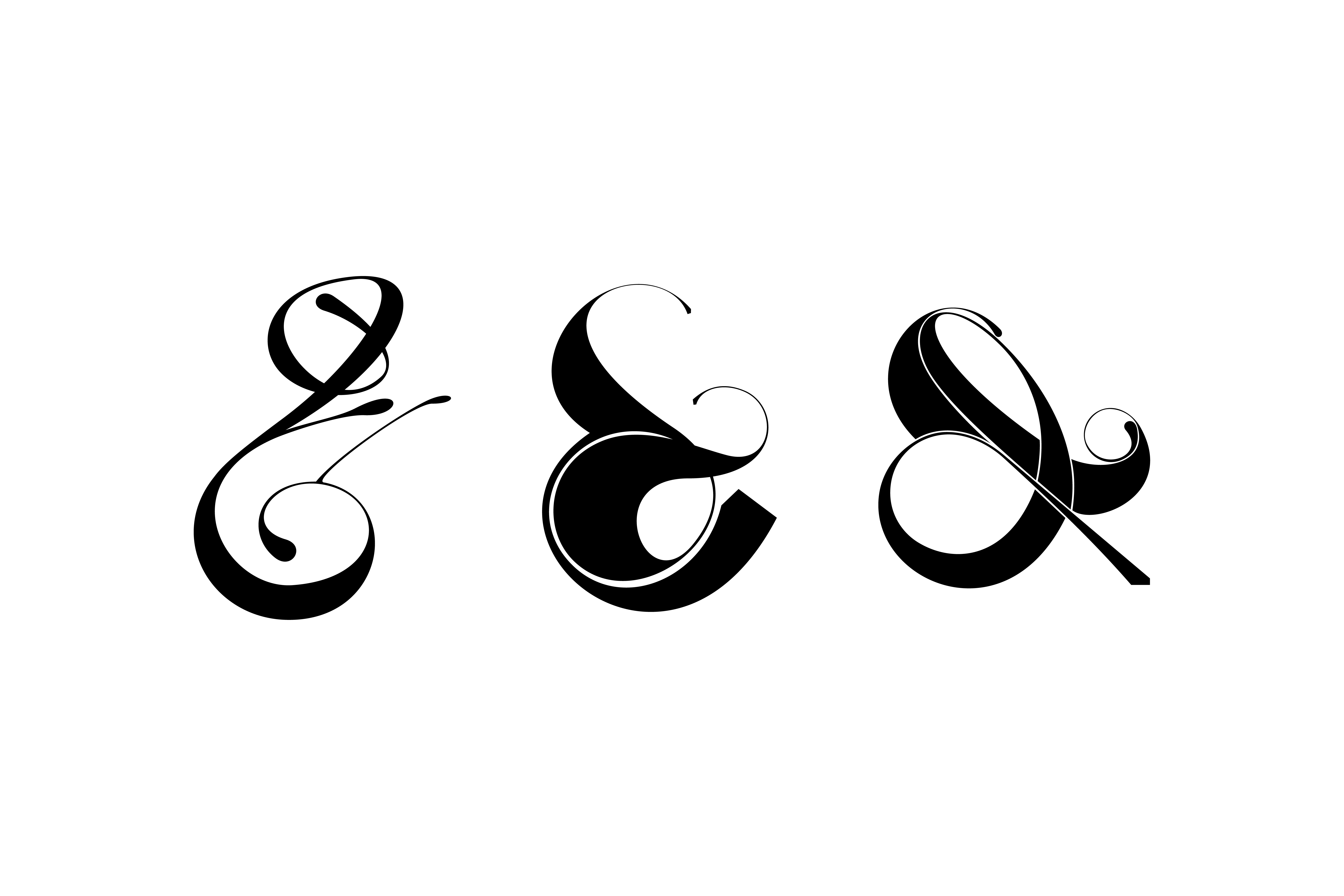
Ampersand from the Playful Ampersand project by Moshik Nadav.
What is your favorite ampersand from your collection?
Well, I love all my ampersands but one ampersand I’m really proud of is the ampersand of Lingerie Typeface. It comes in a few different styles. It’s just a sexy ampersand that combines perfectly with the rest of the font. Lingerie Typeface comes with more than 700,000 glyphs and the ampersands also including swashes. It’s just a beautiful font for fashion and luxury brands.

Lingerie Typeface Ampersand. A Very Sexy Typeface for Fashion & Luxury.
Are you working on new ampersands right now?
I’m always working on new projects, most of them are commissioned by fashion magazines and luxury brands but I also love to sketch ampersands for myself. Who knows, maybe one day I’ll find time to design another project like the Playful Ampersand.
Following his Playful Ampersand Project, one of his ampersand creations became the focal point for luxury brand Lou & Grey’s logo. The results are sensational. (feature photo) Challenging the traditional image, he created this updated, cool and contemporary design, immediately eye-catching and enduringly identifiable. He also custom designs ampersands.
Lou and Grey ampersand designed by Moshik Nadav Typography

Within each typeface created by Moshik Nadav you will find many sumptuous versions of the ampersand. Here are a few examples of Moshik Nadav’s Ampersands:
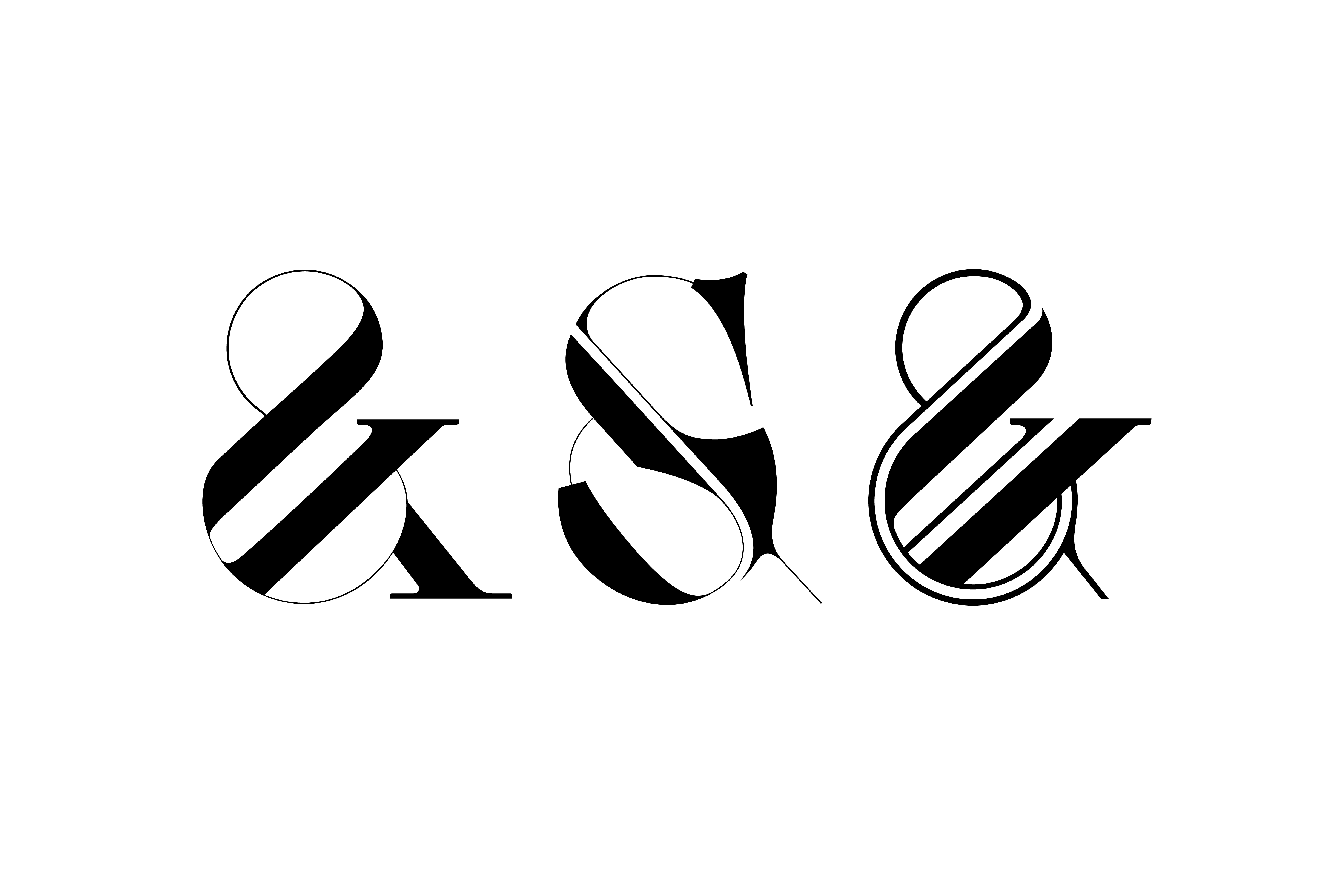
Fashionable ampersands from Nadav’s famous fonts: Paris Typeface Regular, Lingerie Typeface Regular Wild and Paris Pro Regular Strip (Left to right).


