Keep Looking is a high-end make-up and styling studio from Moscow, celebrating the natural beauty. Offering subtle changes to the appearance, Keep Looking respects individual notions of what does it mean to take care of oneself.
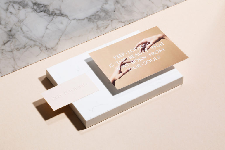
“We’ve been devoted to implement client’s idea into visual identity. The choice of typography takes its cues from the Roman capitals and the classical nineteenth century engravers’ form, which blends antique and modern aesthetics,” say the designers of Redo Bureau who conceived the visual identity together with Alexander Nekrasov and Anna Tsybina.
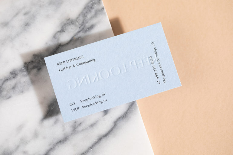
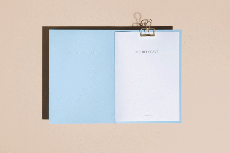
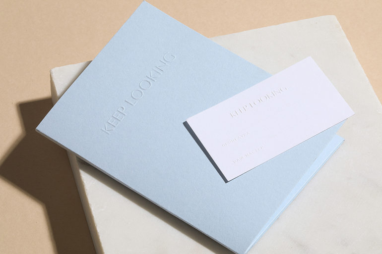
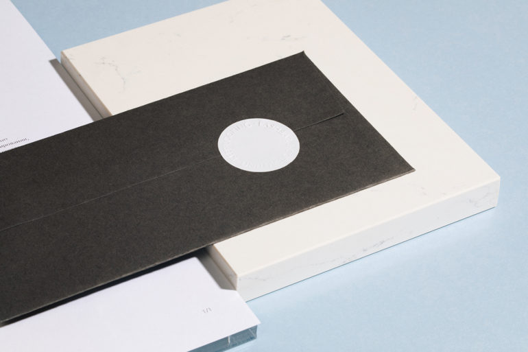
The logo was elegantly embossed onto printed materials and carved into Carrara marble that marks the entrance to the salon. The modern baby blue and beige color palette is yet another not towards clients’ idea of effortless beauty that can be enhanced with minimal, mindful means.