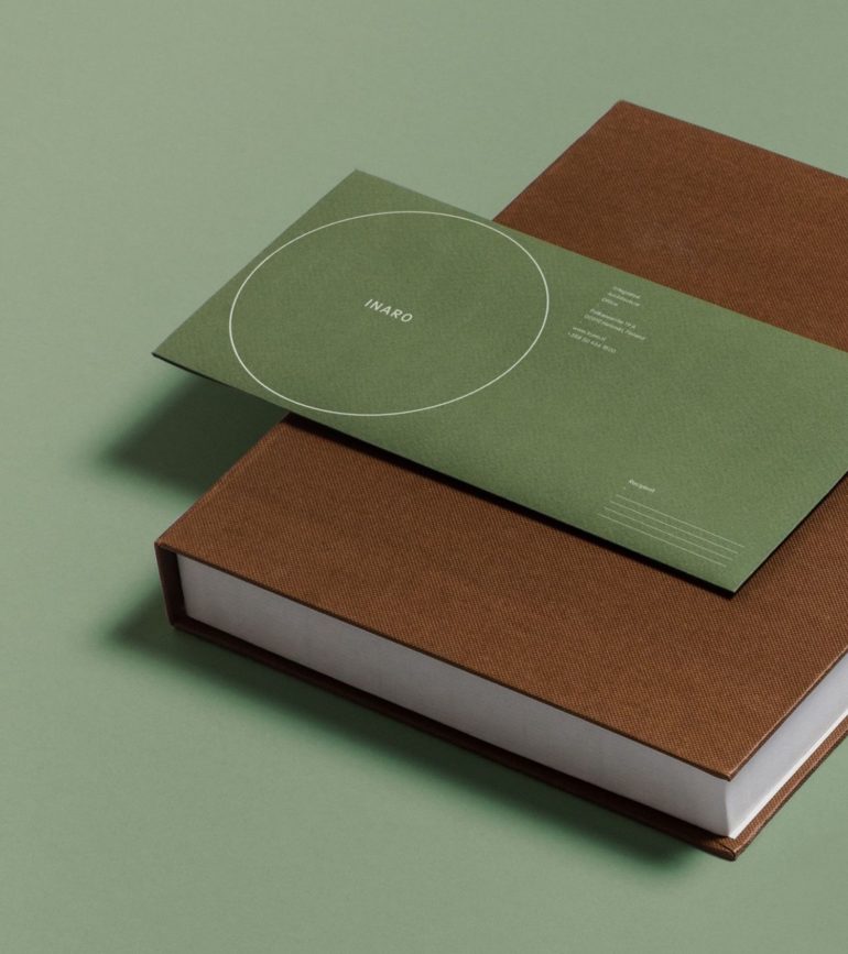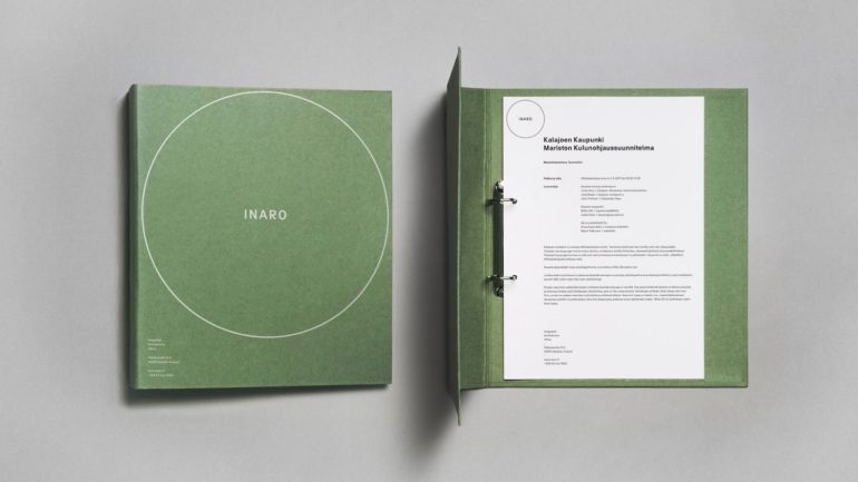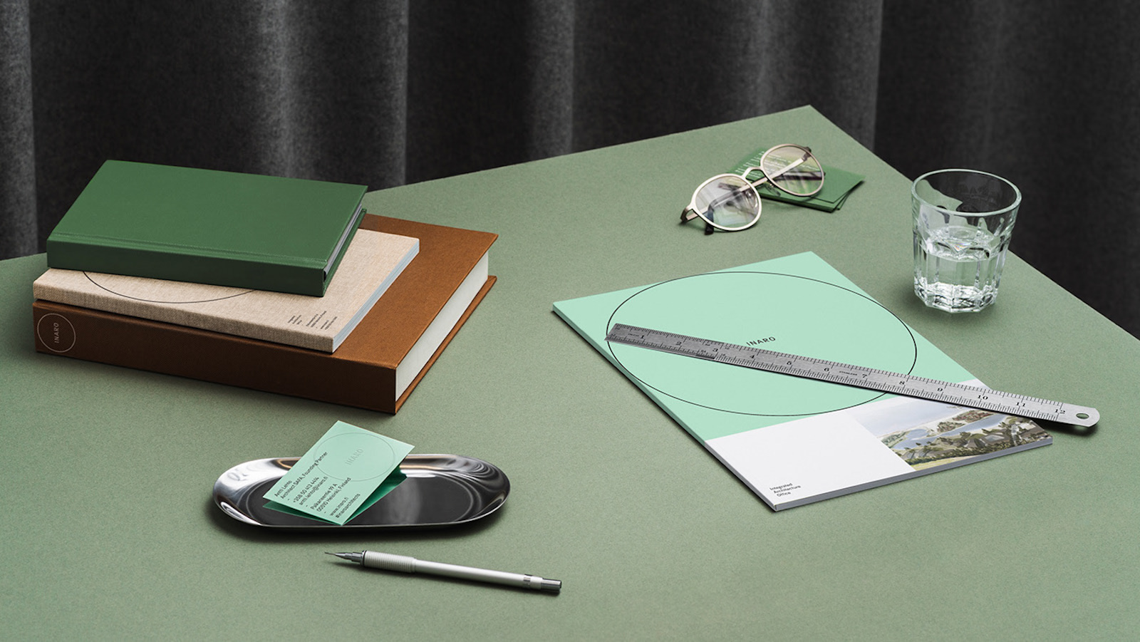
The visual identity for a Finnish architecture practice specializing in urban planning – Inaro – was designed by a local studio Werklig. A minimalist logo consists of a circular shape and sans serif typography.
Complemented with a pastel mint shade, the branding aims to reflect architects’ thoughtful approach of adapting into various environments. From business cards through catalogues and the website, all the elements give a sense of professionalism, elegance and serenity.