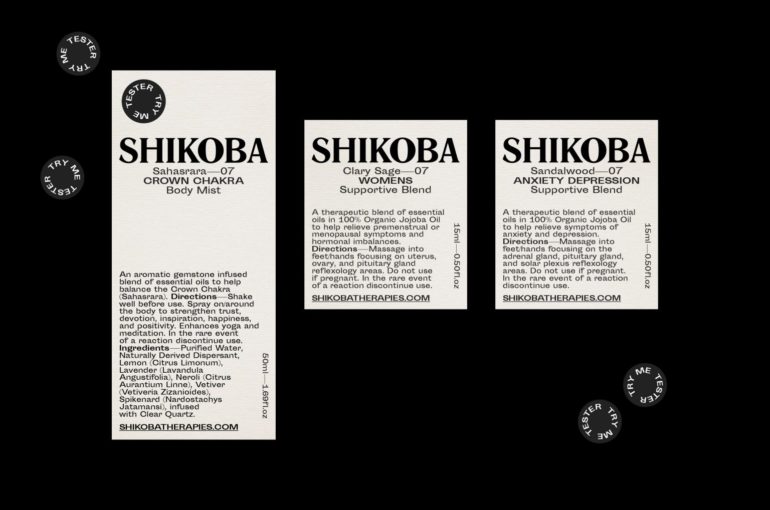
Shikoba Therapies is an Australian wellness brand of essential oils & natural cosmetics was inspired by reflexology. Its natural-scented, powerful oil blends make a perfect daily ritual elevated with a beautifully crafted branding.
Created by STUDIO WORK, it is a reflection of Shikoba’s ethos, expressing values such as balance, effortlessness and serenity. A strong, serif font Romana marks the logo while a soft palette of ivory and black adds a sense of unassuming luxury.

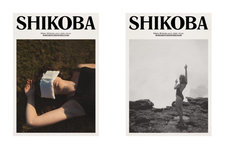
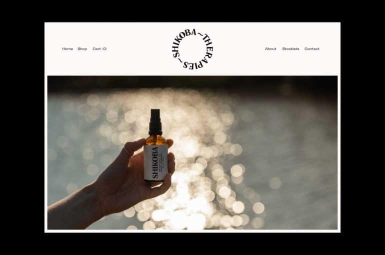
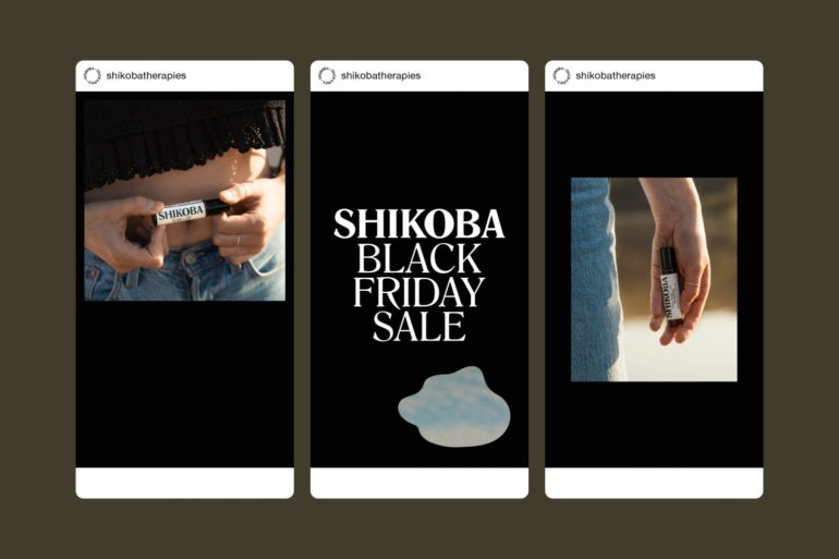
The studio was also in charge of art direction with Shikoba’s shoots reflecting ultimately harmonious ideals – a retreat into nature, the appreciation of everyday rituals. A cohesive strategy was applied to brand’s social media channels and on the website – a seamless experience that leads from casual interactions to conscious purchases.


