


LATEST Feed
![New kind of luxury at Pillows Grand Boutique Hotel Maurits at the Park [Amsterdam] -ready](https://trendland.com/wp-content/uploads/2023/02/amsterdam-pillows-hotel-trendland-featured-370x490.jpeg)


ADVERTISMENT
Get Inspired Everyday in your Inbox!
Be amongst the 200,000+ Trendland subscribers to receive our (free) daily Newsletter!


![New kind of luxury at Pillows Grand Boutique Hotel Maurits at the Park [Amsterdam] -ready](https://trendland.com/wp-content/uploads/2023/02/amsterdam-pillows-hotel-trendland-featured.jpeg)
![Futura Unveils Two Pointman Statues at Potato Head [Bali]](https://trendland.com/wp-content/uploads/2022/12/futura-collab-at-potato-head-bali-trendland-390x390.jpg)
![Mother’s Of Creation | A Kundalini Yoga Retreat in California [READY]](https://trendland.com/wp-content/uploads/2022/12/innparadiso_retreat-trendland-390x390.jpg)

![Futura Unveils Two Pointman Statues at Potato Head [Bali]](https://trendland.com/wp-content/uploads/2022/12/futura-collab-at-potato-head-bali-trendland-370x490.jpg)


LATEST INTERVIEWS
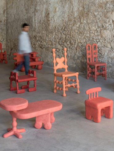
Polina Miliou’s sculptures are brimming with warmth. They announce themselves with bright colours and rough textures, which conceal the tables, chairs and functional objects nestled within. Are they sculptures, or are they furniture? Read

ADVERTISMENT
![Stunning Pediatric Dentist Clinic of Dr. Isabel Cadroy [Spain]](https://trendland.com/wp-content/uploads/2021/11/pediatric_dental_clinic_interior_design_isabel_cadroy-15-370x247.jpg)
ADVERTISMENT
PHOTOGRAPHY
ADVERTISEMENT

![Cj Hendry Latest “Blonde” Exhibition Starts Tomorrow [New York]](https://trendland.com/wp-content/uploads/2021/12/cj-hendry-blonde-exhibition-new-york-6-370x490.jpg)


