Eric Fischer Maps Photographs of Locals vs. Tourists

A pretty ingenious concept and results that easily serve as works of art!

See the full series here


TAGS: , , , , , ,

WHAT DO YOU GUYS THINK?

  • http://www.fittedlife.com Michael

    Wow these maps are quite impressive. They almost look like one of those image scans of a human’s cardiovascular system. It’s pretty neat to see these images mimic veins, arteries and the blood vessels of our bodies. A very neat find indeed.

  • Pedro

    Awesome! What a great way to portray data.

    Would you know of a similar map for Barcelona?

    Thanks,
    Pedro

  • http://themobilediary.com/ Mini Boss

    yes there is a map of barca, just go to the link provided and you can see all the different cities.

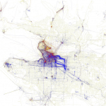
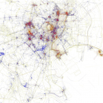
I came across these maps and was immediately drawn in. I had no idea what the maps were illustrating but their appearance was captivating enough to make me do a little additional research to find out. Photographer and digital cartographer Eric Fischer created maps of 50 cities for which he used the geotags of photos uploaded to Flickr and Picasa to plot out every photograph taken on a street map. He divided the photographers into three camps: 

Blue for locals (people who have taken pictures in a city over a period of a month or more), red for tourists (people who took pictures in a city for less than a month) and yellow for undetermined.

icon
Eric Fischer Maps Photographs of Locals vs. Tourists
PREV
1 / 5
NEXT
Array