
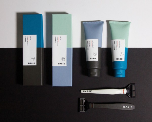
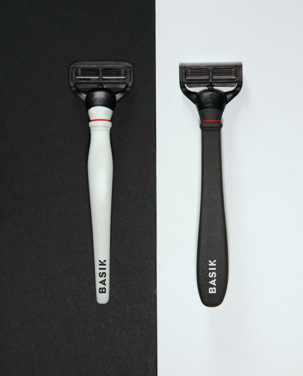
To the naked eye, the greatest difference between mens’ and womens’ razors is the color of the handle — blue vs. pink — and a few dollars on the price tag. The marketing decisions and visual branding of razors and shaving gels creates a highly gender specific connotation of virtually the same product.
As part of her thesis, Saana Hellsten, a graphic designer from Finland has questioned these stereotypes and created a packaging solution more suited to our current society, a society that is full of diverse individuals with blurred gender identities and changing gender roles.
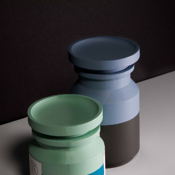
BASIK strips away the gender from the packaging of shaving goods and instead focuses on the function — the purpose of your shave, the shape of the handle and the color that appeals to you. She also applied this thinking to household goods, taking the femininity out of “soft”, “sensitive” products like laundry detergent and air freshener, and removing the masculine design from “strong”, “powerful” products like drain cleaner. The gender-neutrality of BASIKS aims to combat gender equality and clean the slate on traditional stereotypes.
Written by Romy Erdos


To see more work visit : www.saanahellsten.com


